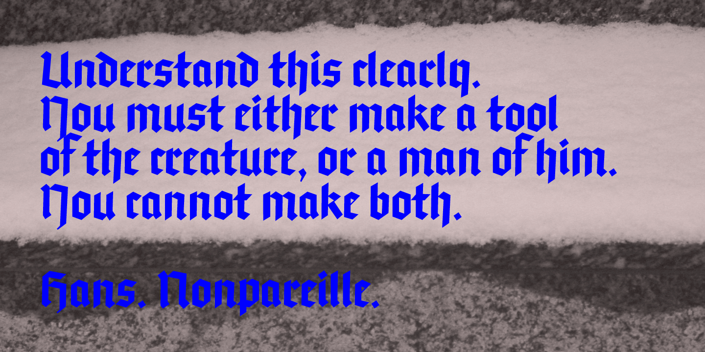
In the Textura blackletter, legibility is less important than texture. The Hans typeface is particularly dark, dense and harsh. It is an abrupt typeface, with no smooth outlines, close to the expre
In the Textura blackletter, legibility is less important than texture. The Hans typeface is particularly dark, dense and harsh. It is an abrupt typeface, with no smooth outlines, close to the expre