Blog
On Kinetic Typography and How It Moves Us
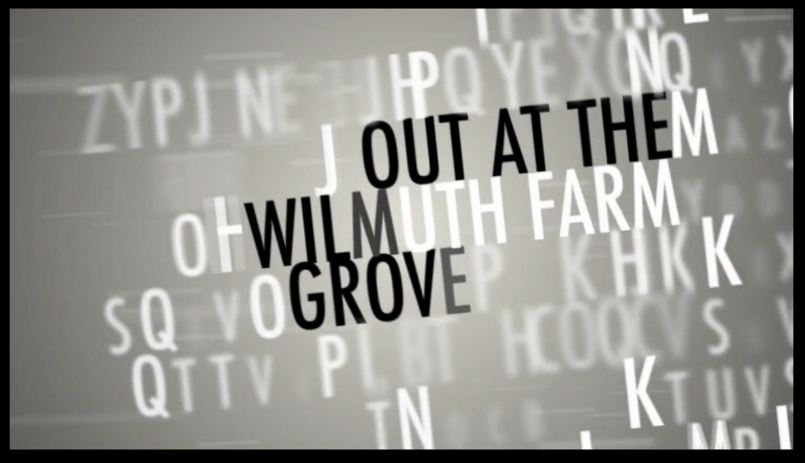
Do you know those goodie bags they give to all the nominees at the Oscars? Probably not, unless you were nominated. In which case, well done! But we thought we should follow this tradition and come up with our very own kinetic typography goodies bag. When you’ll rummage through you’ll find tutorials, inspiring videos, and inspired reads. Some of you might ask, OK, but what is kinetic typography? Etymology makes it easy, as ‘kinetic’ comes from the Greek kinetokos - relating to, characterized by, or caused by motion. So, kinetic...
Read more →
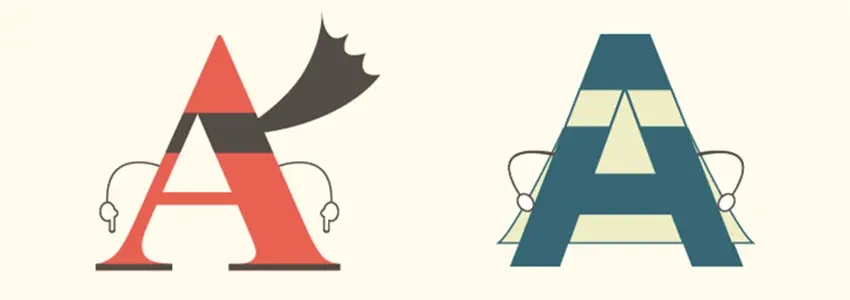
Film Festivals: Logos and Types
It’s Monday, but we’re in the mood for film festivals. Sometimes it's just film festival posters, or logos, but we blame the types genie for this. There are those festival logos we've been seeing for decades, and there are rather obscure festivals (and logos) but equally intriguing in typographic terms. That's how we decided to put together this motley collection and get a taste of several different approaches. Some logos just force us to hit the couch and grab a bag of popcorn every time we see them. Some leave us quite indifferent....
Read more →
This Week in Type #3
The last week of February made us think about the future of responsive typography, but also look back at pictograms and hieroglyphs. Nothing like a good history lesson to understand the present and the future, right? Talking about lessons, we came across a great collection of infographics about typography and hurriedly bookmarked it. Typography apps and walks also caught our eye, so the weekend looks exciting too. Without further ado, let the round up begin! Creating Exciting And Unusual Visual Hierarchies This article takes a closer...
Read more →
Wednesday Inspiration: Non-fiction Book Covers
We’ve been browsing through virtual bookshelves and picked 15 covers that caught our eye. What’s special about them is the intense use of typography to the detriment of other design elements. Whether you just admire the book, browse through it or end up buying it, the typography on the cover can obviously add extra appeal. Our selection focuses on non-fiction book covers, for the simple reason that these are powerful books which tackle real events, topical issues, and are the materialisation of months or years of research. So, is...
Read more →
Serif vs Sans: The Final Battle
Here's a neat infographic that explains the differences between serif and sans serif fonts. You'll learn when to use one over the other as well as examples and web usages. Let us know what you think!
...Typography Magazines, Journals and Hubs. Part 2
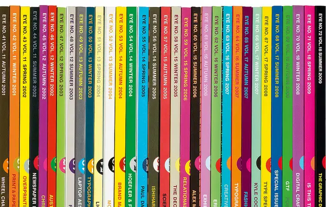
Last week we talked about typography magazines and we focused on the print, limited editions and university publications. This week we continue our discussion with a couple of veteran online publications and more print magazines. Baseline is an international first rate periodical for typography and graphic design matters published three to four times a year. This serious venture provides a rich mixture of articles and reference materials on our dear typography, of course. The contents are deliberately eclectic and the editorial...
Read more →
This Week in Type #2
Time to hit the exhibitions, people! Not the virtual ones, the real ones, with displays on walls, mingling and all. At least that’s what the articles we came across this week brought to our attention. There is a significant amount of awesome typography exhibitions out there and you should try them. It’s a bit like typography sans frontières. But fear not, there’s more to this week’s roundup. Let’s start! Celebrating Typography In Chicago March 1 is a good day to be in Chicago because that’s when Typeforce, the 4th annual...
Read more →
Wednesday Inspiration: Textured Typography
There’s no big secret behind the popularity of textured types. They are fun, but they can also be realistic, and quite often they can be realistically funny. It’s about that extra touch that helps your mental circuit imagine and recreate the message carried by the words themselves. However, grungy types can be the result of the meticulous tinkering of designers, but also the accidental works of nature on mural typography, street engravings or advertising banners with a twist. Quite often the results are impressive and they can...
Read more →