Blog
This Week in Type #17

This new Sketchnote typeface, created by Mike Rohde, the author of The Sketchnote Handbook, is designed to be practical, to convey the human character and quirks of Rohde's normal handwriting and hand-drawn lettering with the benefits inherent in digital fonts. The family is comprised of four fonts: Sketchnote Text in regular, bold and italic, plus Sketchnote Square, with some cute illustrations thrown in for good measure. Take a look! What do you think?
Colorful Typography Print by Katie DaisyThis collection of unique typography art pieces by Katie Daisy is quite sweet, inspiring for those into flowery, colorful, springy inspiration.
Typography meets Retro Photography Here's some more inspiration. For those who don't know, Stéphane...Wednesday Inspiration: Universities Typography

The types used by venerable universities is probably not one of the decisive reasons for your choice, but you can’t deny that a good type in the right place can work miracles. We brought together logos from all around the world. They are the types that students will see everywhere for a few good years, not to mention that they will be on their diplomas for eternity.
Notice how playful the types in newer universities can get, and the special attachment old universities have to their mature types. Don't worry, they're not all Old English fonts. It’s a pretty interesting trip. Take a look! In your opinion, which type has graduated with distinction? Do you have a favorite uni logo? Share! Berkeley Princeton Sapienza Napier Oxford Liverpool Exeter Cambridge Brown NYU Drury Goldsmiths Sydney Hong Kong Stanford Sorbonne ...Designing Type: The First Steps. Part 2
Last Monday, we introduced you to a few resources that should come in handy if you happen to be a beginner interested in designing type. Today we continue with more useful resources for those new to typography.
Online TutorialsNever underestimate the power of tutorials! They are made for users who don’t have the time or the money to attend workshops or design schools. Yes, there are more reasons, but that's not the point. You can even read them on your mobile device on the bus. So, handy is an understatement.
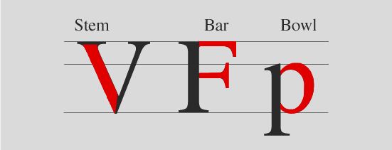
You could start with this series of tutorials published on Noupe.com a couple of years ago. This crash course in typography aims to underline the fact that typography is one of the most important elements of any design project. And that being intimidated by typography is not an option. The first part deals with the ‘Basics of Type’ and it will teach you the difference between typefaces and fonts, weights and sizes, how to classify type, the anatomy of the typeface, what are the four basic classifications for Sans-serif...This Week in Type #16

Wednesday Inspiration: Street Names

Designing Type: The First Steps
This Week in Type #15

Wednesday Inspiration: Sitcoms and TV series