This Week in Type #19
You’ll be swimming in tutorials this weekend, because we came across 90 of them. For those who prefer other recreational activities, we have a short history of typography, lyrics onto walls, types as art and striking typography to spread witty messages. Let’s stroll:
90 Top-Class Typography Tutorials
Here you have some of the best typography tutorials on the web, because, honestly, you can never stop learning about typography or improving your skills, right? You’ll learn how to design a headline typeface, create isometric 3D lettering, smelt your favourite font and much more. You’re bound to find something that can help you raise your type skills to the next level. Bookmark it now!
Sam Winston’s Typography
For the “Memory Palace” exhibition at V&A, in London, Sam Winston has created this typography piece of art based on a text by Hari Kunzru specially written for this occasion. Read the article and browse through the pictures to discover more.
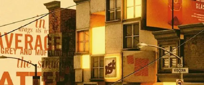
In London Hotel, Artist Paints Beautiful Typography Of Britpop Lyrics Onto Walls
Illustrator, designer and mural artist Tobias Hall has painted a typography-based mural in Camden, London, to pay tribute to the birthplace of Britpop. The mural is within Holiday Inn. Why Camden? This is the place where Britpop originated. Hall chose lyrics from three well-known songs as the words on his murals. He then added playful, bespoke lettering to each alphabet in order to bring them to life. Modern fonts, within limits, of course. Check out the article to see the result.
A Brief History of Typography 1928 – 1980
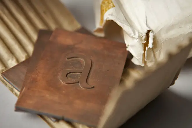
We just found out that at Monotype’s “Pencil to Pixel” pop-up exhibition in New York City last month, 3,400 students and professions learned about the history of typography. Artifacts demonstrated how metal type was historically designed, made, specified by designers, and set by typesetting companies — and translated into today’s font menus for individual users. This article has some interesting quotes and close-ups of some of the artifacts that were on display as well as some typography history. Enjoy!
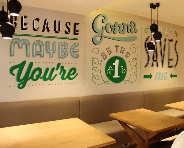
Re-Brand Campaign Uses Striking Typography To Spread Its Witty Messages
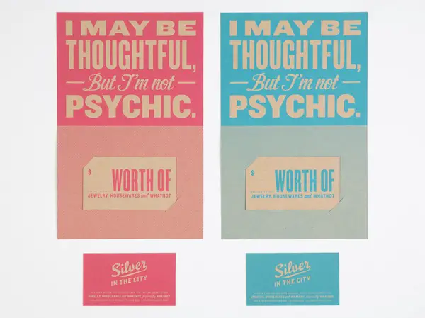
“Silver in the City” is an unconventional gift store that has recently launched an attractive re-branding campaign. Created by Young & Laramore, the project is centered around striking typography, witty slogans and skillful use of color. Playful, stylish, not to mention that the humorous and unexpected copywriting makes one feel that shopping there would be a fun experience. Click on the image if you want to see more images from this creative re-branding campaign.
Typography 3D Projects
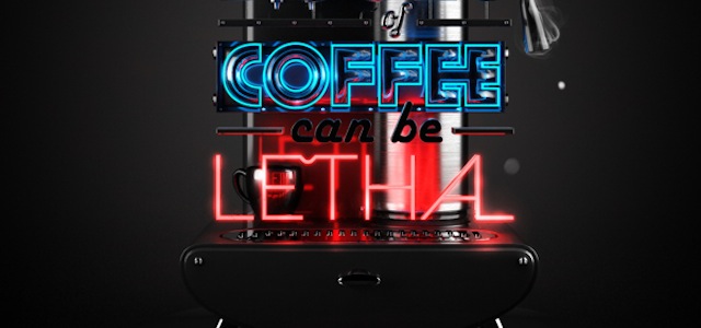
Time for some inspiring 3D typography now! Neon lights and traditional elements was the main source of inspiration for this piece. Read the article and find out about Tiger Beer, how this piece of digital art came into being and more. Enjoy!
And have a great weekend!