This Week in Type #6
It’s our Friday round-up, that time of the week when we look back at the articles and types that caught our eye, stirred our imagination, taught us something new, made us smile or laugh out loud. Here’s what we stumbled upon:
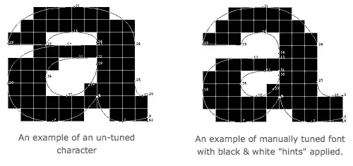
Coming Soon: A Monotype Exhibit Tracing The Roots Of Modern Typography
Meet the Monotype Corporation! It was founded back in 1887 when typesetting actually involved setting type. They are behind some of the most important 20th-century fonts and this May the company is giving it the next best thing: a sweeping exhibit called Pencil to Pixel. The show will include artifacts from more than a hundred years of designing type, ranging from original hand drawings of molten metal faces to their first bitmap designs. And other similar treats. Pencil to Pixel will be free but will require a reservation. A must for type fans who happen to be in town.
‘Font Nerd’ App Challenges Typography Geeks To Identify The Type
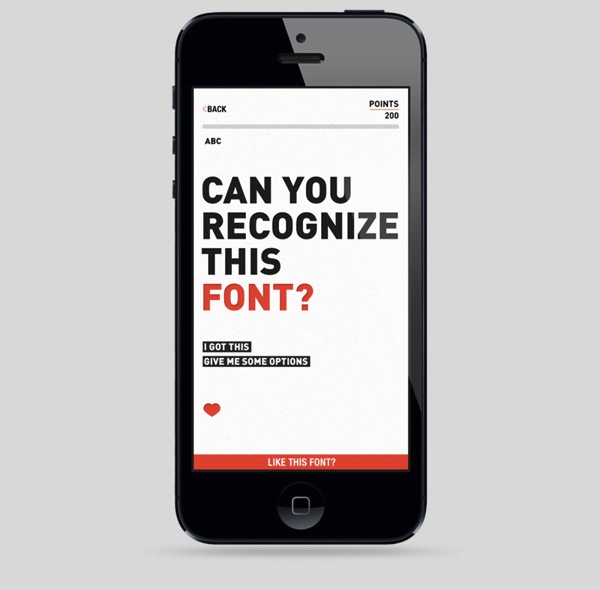
All those who love typography, raise your hands! Denmark-based graphic designer Andreas M Hansen made an app just for you. ‘Font Nerd’ puts users aptitude for spotting typefaces to the test. It just presents the typeface that’s up for guessing in witty questions— of which users can opt to see the whole alphabet, and have to guess or choose among options for the right answer. Typophiles, check out for details and let the games begin!
Typography Project Reimagines Rock Bands As Fonts
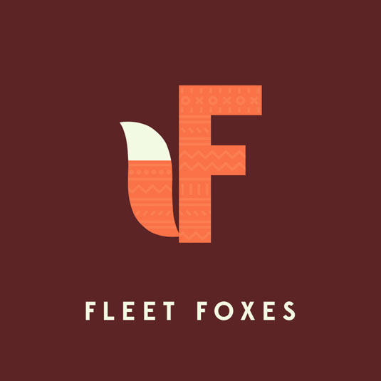
Jim Billy Wheeler is from Bristol. He just wanted to combine his love of music and design into one crowd-pleasing project. Since this is an ongoing project, Jim will continue to post up the rest of the music-related alphabet over on his Facebook page. Cute creatures, great soundtrack, inspired types. Enjoy!
Our Favorite Typefaces of 2012
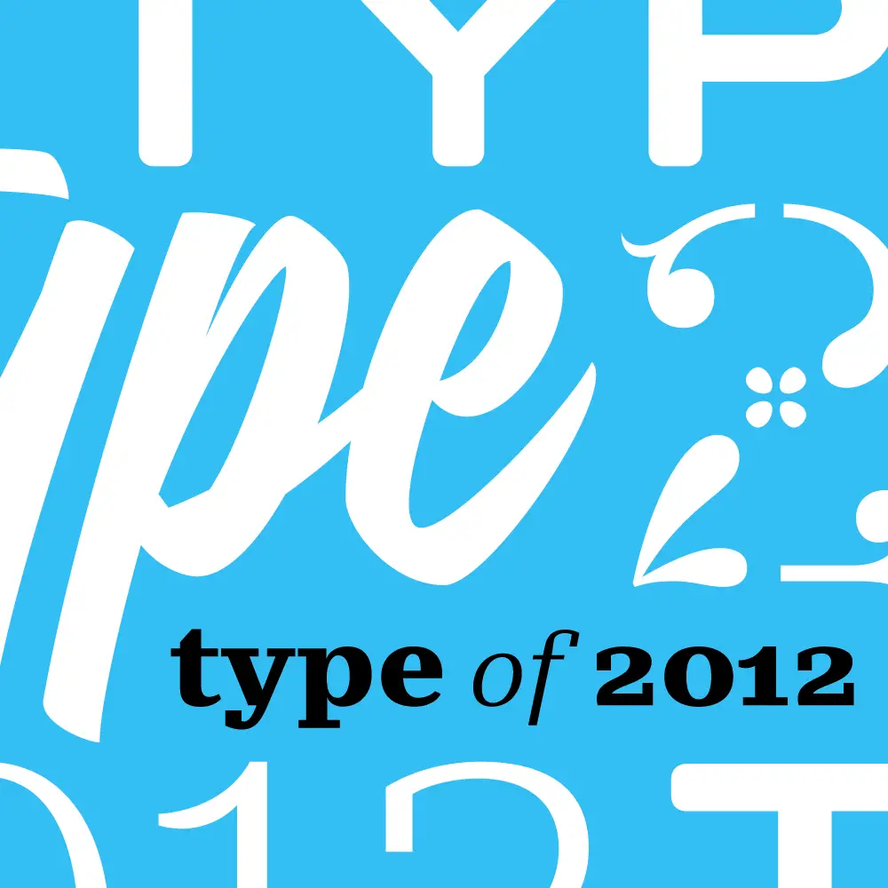
In this one, smart and articulate font users and makers select their favorite release of last year. The general conclusion: 2012 was a strong year. Browse around!
Improving Readability With Proper Typography

What would content be without readable typography? Pretty pointless. Some of the rules and principles that became standard in achieving readability and typographical beauty are discussed in this article. Most of them are based on T. Kaikkonen’s Interactive Guide to Blog Typography. Useful read. Take a break and enjoy it.
Entertaining Typography of Famous Scientists’ Names
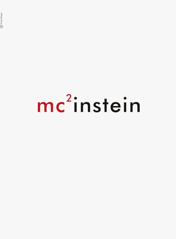
Inspiring series of typography graphics honoring some of the most famous scientists that have lived. They were created by Mumbai-based graphic designer Kapil Bhagat in light of National Science Day in India. Don’t miss Newton’s apple and Galileo’s telescope.
Mixing Typefaces: Tips and Techniques
If you think that mixing typefaces can be on of the most rewarding, but also trickiest parts of the design process, this article is for you. Good luck with creating the perfect pairing of typography!
Have a great weekend and don’t forget to tell us what other great reads you came across this week.