On Kinetic Typography and How It Moves Us
Do you know those goodie bags they give to all the nominees at the Oscars? Probably not, unless you were nominated. In which case, well done! But we thought we should follow this tradition and come up with our very own kinetic typography goodies bag. When you’ll rummage through you’ll find tutorials, inspiring videos, and inspired reads.
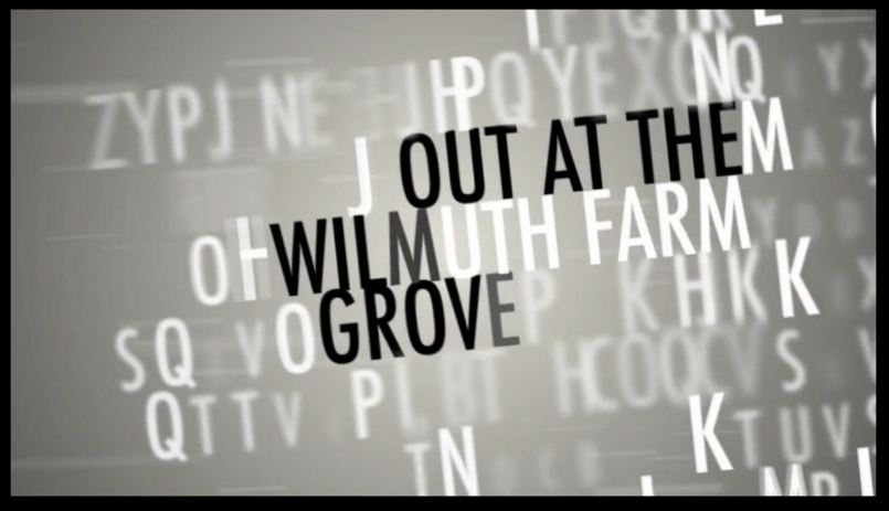
Some of you might ask, OK, but what is kinetic typography? Etymology makes it easy, as ‘kinetic’ comes from the Greek kinetokos – relating to, characterized by, or caused by motion. So, kinetic typography is the technical name for “moving text”, an animation technique mixing motion and text to convey or express ideas or emotions using video animation. As expected, this technique is very popular in movie title sequences and credits, web page animation and other entertainment media.
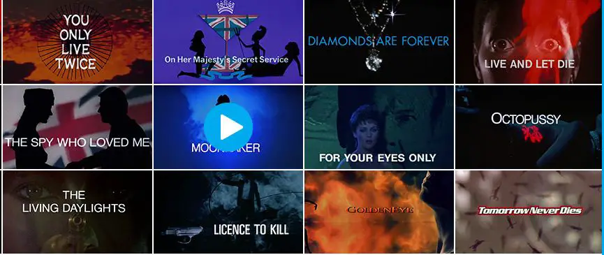
Talking about film titles, we found a website equally appealing to typography fans AND film buffs: The Art of the Title which is an online compendium and leading web resource of film and television title design from around the world, many of which feature kinetic typography. Recently they put together 50 years of main title design for James Bond films, which perfectly illustrates the strong typography – film titles relation.
For those new to the trade, but already excited about kinetic typography, here you have 2 tutorials that should put a spring in your step. One is in 6 steps, the other one in 22 minutes. Good luck!
For music fans, kinetic typography has its own special place, as you can also visualize the words you enjoy so much. A bit like a smart, great looking karaoke. Take this Tom Waits, for instance. It makes sure you get the messages, imprint the words in your brain while getting a pretty good idea about what the artist was saying. Also, don’t miss the clip for “Dream,” by the French band Husbands. This is a lyric video in the purest sense, making use of a variety of typefaces, and spacing them out in a pleasing way on your screen. But we’ll not spoil the real surprise. Take a look!
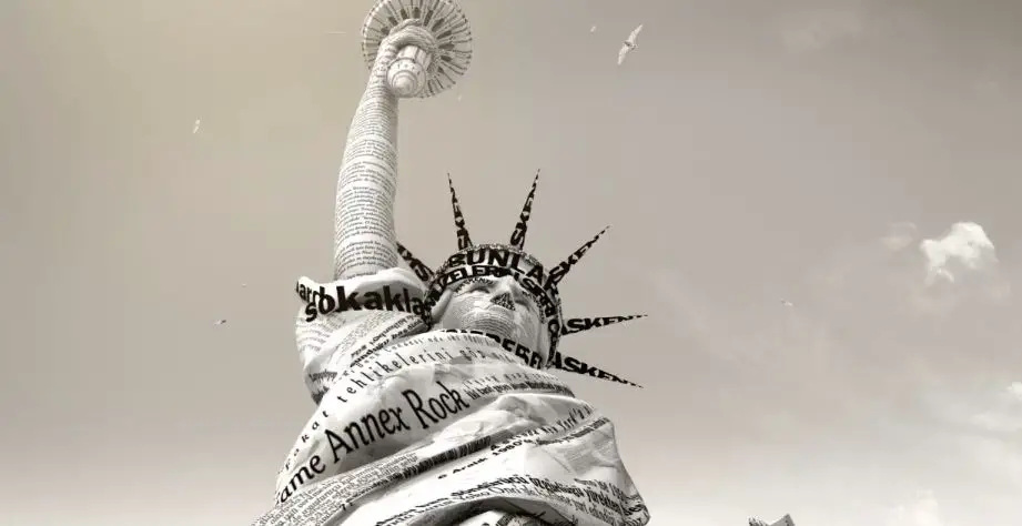
Other people use kinetic types to express their love for… Minecraft, to advertise the launch of the Turkish edition of The New York Times in 60 seconds of typographic goodness, mastered in 2K. Or just to pass an exam.
If you’re really hooked, then you should subscribe to this Vimeo channel dedicated to Motion/Kinetic Typography and learn a bit of German while browsing through this Manifest of the moving scrip.
Last, but not least, feast your eyes with this Stephen Fry Kinetic Typography Language. If you haven’t seen it yet, better dig in. A bit of Adobe, a pinch of Flash and Illustrator, and an awesome essay on language = highly enjoyable material. It manages to capture the strong connection between words, typography and their beauty in all shapes, sizes and mediums. You don’t get over 1 million hits just by animating words, so the spoken word is essential here too, and, frankly, quite hard to resist. Enjoy! And don’t forget to let us know what moves you.