This Week in Type #2
Time to hit the exhibitions, people! Not the virtual ones, the real ones, with displays on walls, mingling and all. At least that’s what the articles we came across this week brought to our attention. There is a significant amount of awesome typography exhibitions out there and you should try them. It’s a bit like typography sans frontières. But fear not, there’s more to this week’s roundup. Let’s start!
Celebrating Typography In Chicago
March 1 is a good day to be in Chicago because that’s when Typeforce, the 4th annual event celebrating typography and lettering, starts. The exhibition features some of today’s youngest, strongest, and most contemporarily relevant design, type, and lettering talent. You’re in for quite a treat.
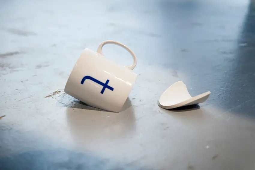
Handmade Type Experiment by Tien-Min Liao
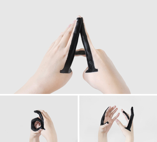
This is the work of Tien-Min, a New York based communication designer. His new project, “Handmade Type”, is a self-initiated typographic experiment exploring the relationships between upper-case letters and lower-case letters. It also records the transformation between them. Inspiring stuff, take a look!
In Berlin, A Museum Of Letters For Typography Lovers
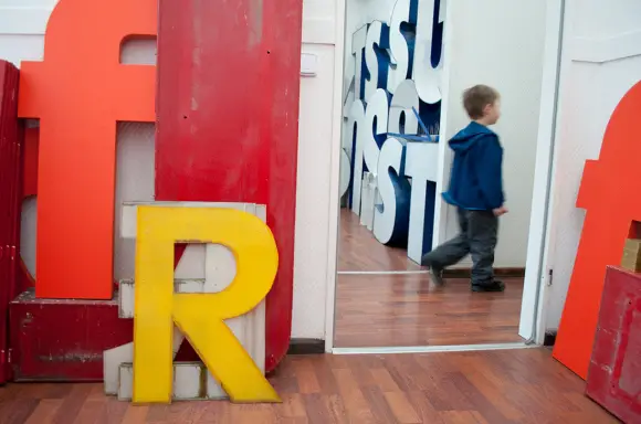
Typeface geeks who happen to be in Berlin, gather around! Don’t miss Buchstaben Museum – also known as the Museum of Letters, because it celebrates our beloved typefaces. This is the home to hundreds of letters that have been “rescued” from public spaces and folded businesses. Huge letters, gotta see that!
Nokia Pure / Typography Exhibition
This is no breaking news, but the ‘Nokia pure’ topic stirred new conversations online these days, and we enjoyed revisiting it. The exhibition that took place some while ago promoted the new font ‘Nokia Pure’ designed by Dalton Maag. The story goes that London design agencies were asked to produce artwork using the new font. Many magazines, such as Creative Review wrote about it, and the whole experience is a good example of celebrating the birth of a new type. Find out more about it here.
Adobe Proposes New Standard for Better Web Typography
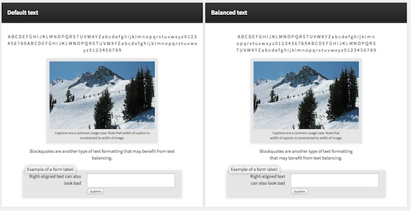
In its effort to bring better typography to the web, Adobe came up with a new proposal for the so-called ‘Automatic Text Balancing’. What does this mean? It means that if browsers adopt text balancing it’s the end of typographic unsightliness like widows, orphans and ragged lines, and would go a long way to creating more readable text on the web. Learn more!
How to Tell Your Client That Some Typefaces are Better than Others
This article deals with the agony of choice. Nothing too philosophical though, more like practical advice for designers faced with the grueling task of choosing between fonts and types for a design. It mainly works like a puzzle, where you have to find the right pieces. The author goes one step further and brings “dealing with what the client wants” into the equation. So, how do you tell your client that the font you chose is better choice than the one he wants? Tricky indeed.
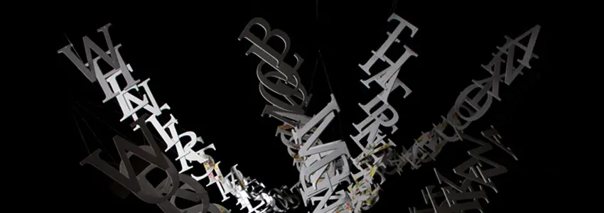
Swirls of Liberated Words Become Dancing Sculptures
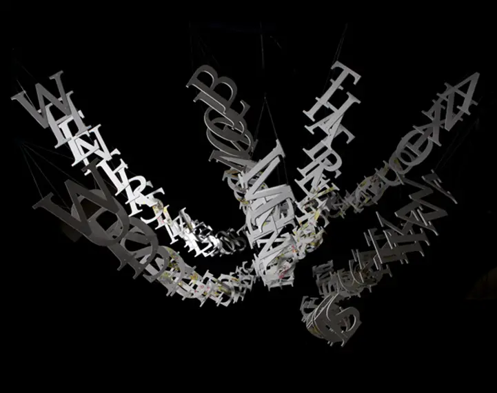
Meet Ebon Heath, a master of words, whose work should conclude our roundup beautifully. His typography sculptures transform the written word into what he describes as a “new language of physical type.” The printed letters get a three-dimensional existence. Magic! Read on. And don’t forget to have an inspiring weekend!