Blog
Last Two Weeks in Type #24
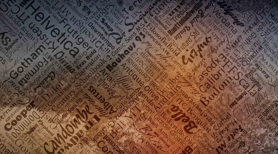
We're hours away from the New Year, but we still feel like taking one last look at 2013. Particularly the last two weeks, since we last talked. Today: more resources, trends to leave behind, old typo feuds, inspiration and even exciting... fails. Resources And Tools That Will Make Typography Easy To Work With This comes handy for those web designers on the look-out for new techniques. Especially for those who are very particular about their work and the reputation that follows them. Long story short, in this article you'll find a few good...
Read more →
Last Week in Type #23
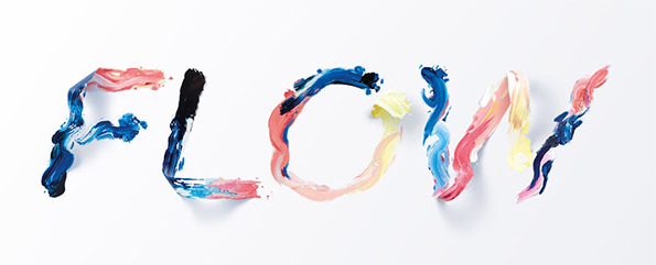
Special characters, redesigned famous logos, typefaces made of paint stroke, and much more. Plus another list of some of the best fonts of this year. Keep them coming! Enjoy! The Designer's Guide to Special Characters When it comes to clear writing, the importance of the mechanics of spelling, grammar, and proper punctuation are always stressed. However, for some reason, the importance of using the correct typographic special characters is often overlooked. So, it’s time for designers to stand-up and use the right typographic...
Read more →
Last Two Weeks in Type #22
It's December already. So much to do, so little time. But hey, in these merry busy times, we're pretty sure you'll find time to take a look at some of the most important online articles on typography published in the last couple of weeks. Beautiful typography, amazing calligraphy and calligraphers, tools to identify fonts, and more. Enjoy! The Most Beautiful Typefaces From This Past Month Maybe not 'the most', but definitely some very handsome ones. Here's another fantastic batch of type. For your inspiration, of course. 4 Great Tools...
Read more →
Midweek Inspiration: Black & White Typography
It's not because winter is here, and because in some parts everything is already covered in white, it's because rummaging through black and white typography sometimes can be more refreshing and inspiring than you can imagine. It all makes more sense, the types jump off the page and their striking beauty is matched only by the message they convey. Here and there you'll come across fine shades of blue, and grey, but you're really on B&W soil. Distorted fonts or not, they're all black and white in the beginning. Aren't they? Enjoy! By the...
Read more →
This Week in Type and Graphic Design
Today we’re doing a different round up, as we’re taking a closer look at interesting graphic design articles too. You'll find tips, tools, tricks, but also some typography goodies. We couldn't help it. Always ready for some funky fonts. By the way, do you know the scent of Helvetica? Helvetica The Perfume: The Scent of Nothing Good packaging sells. Agree? At least that's what the author of this article thinks after experiencing Helvetica The Perfume. The temptation to buy a bottle just to stare at is strong. But see for yourself what...
Read more →
Last Three Weeks in Type #21
Games that help you learn the history of typography, beer coasters designed as conversation pieces, typography to help people understand dyslexia, hand-made typography projects, fonts that kill designs, and more in today's round-up. Sophisticated fonts and creative restlessness run through these past couple of weeks. Take a closer look: Learn the History of Typography Through Type:Rider Even if you're one of those 'font fanatics' who knows Gary Hustwit's Helvetica by heart, you'll still learn something while playing Type:Rider....
Read more →
Midweek Inspiration – Music
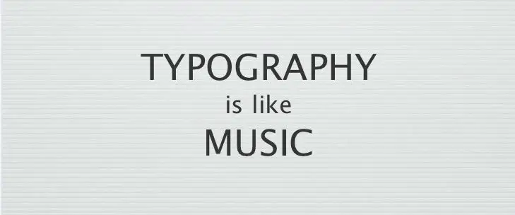
Have you ever been asked to do some types for... music? I'm talking about the word itself here. Because the truth is that this particular one carries the sweet burden of sound that needs to be turned into visuals. You have to admit that it can be quite a challenge, although probably not as hard as setting types TO music. But let's not slip into surrealism, and stick to collecting some inspiration for creating types that ring more than just a bell. Probably the most common association people make is between funky fonts and music, but there are...
Read more →
New Books on Typefaces
As promised before, we're returning with an update on new books about design, in general, and types in particular. After browsing through the virtual shelves, we've picked a couple of titles about typefaces that changed the world, those in the urban landscape and last, but not least, those in magazines. These are fresh titles discussing old and new fonts alike. Handle with care. And curiosity. Enjoy! Design Museum Fifty Typefaces That Changed The World This book, published in September 2013, under Typography & Lettering, explores...
Read more →