This Week in Type #13
There’s a symposium coming at the beginning of June and one of the most important typography exhibition ever (some say) is still waiting for you. We found mid-century inspiration, 3D typography and kinetic… advices. We even have something for those who have money to spare.
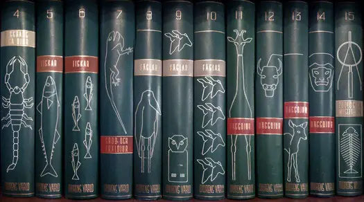
TypeToy: A Beautiful Archive Of Mid-Century Design & Typography
You’ve probably come across Aaron Eiland before. He keeps a blog stuffed with design and typographic goodness from the mid-20th century. TypeToy is a delight to browse for anyone who appreciates that era. From attractive packaging to gorgeous book covers, the blog documents a diverse range of beautiful graphic finds, creating fascinating snapshots that show what design was like in “the good old days”. This made us nostalgic, so we ended up browsing for more retro fonts. To bookmark for vintage inspiration!
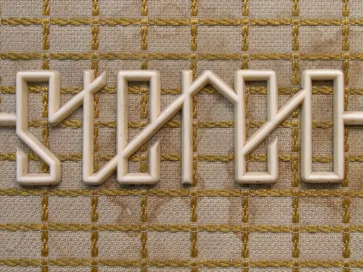
Six Beautiful Artifacts From the Dawn of Digital Typography
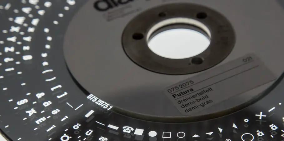
Pencil to Pixel is one of the most comprehensive typography exhibitions ever staged, so it’s little wonder that we are still talking about it. This week we found a post where you can see pictures taken in the exhibition. You’ll notice that it preserves some of the most fascinating relics from the 1970s and 80s, allowing you to see the early technologies that predated digital type. The explanations and images in this post will open up your appetite even more.
Typography World Map
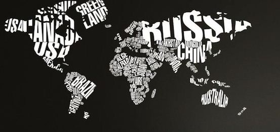
For those interested in spending some money, here’s a One World Map in Typography measuring roughly 22″ x 45″. Vinyl lettering, custom hand painted look, and other fancy touches. Just an idea.
The Stunning 3D Typography of David McLeod
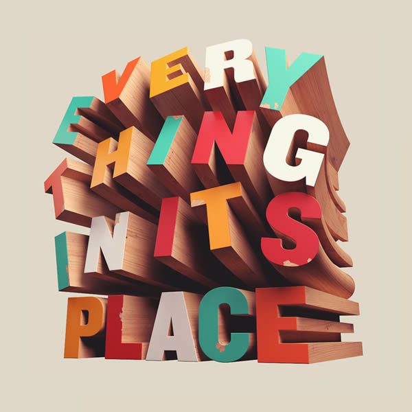
David McLeod is an Australian artist and this article takes a look at some of his works. It is quite enjoyable as you get to see typography caught up in designs in a way that keeps imagination very much alive. You’ll also get to take a closer look (literally) at the images. Quite inspiring material. Enjoy!
Make Good Art Kinetic Typography
This Kinetic typography YouTube video “shows” an excerpt from Neil Gaiman‘s University of the Arts commencement speech. Yes, there are many out there, but this one carries a few messages that should do you good. It starts with “When things get tough, this is what you should do: make good art. I’m serious.” So are we. Keep reading, listening and learning. But most of all, enjoy!
After the Jump: Technology’s Effect on Design and Typography
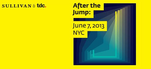
After the Jump is a symposium that will bring together some of today’s most inspiring industry leaders to discuss how technology affects human behaviour and how those effects impact design and typography. The event will take a holistic look at typography’s role in the modern, tech-driven world. So, Cooper Union, NYC, June 7, 2013. Enough time to make a decision. Interested?