This Week in Type #10

This Friday we look at those 9 typography mistakes you should avoid, although we’re sure if there are more, you’ll let us know. But we’ll also keep you smiling with a nostalgic tribute to typography in films, an analysis of bad fonts (and why they are not that bad after all), a bit of typography for beginners, interviews, ‘string’ typography and… wallpapers.
9 Typography Mistakes to Avoid
For those who want to avoid typographic mistakes in the future, here are nine examples of what you did in one form or another, and solemnly vow never to do again. From ‘illegible typeface choice’, ‘poor readability’ and ‘bad font choice’ to ‘no typography contrast’, ‘bad typeface combinations’, it’s all in there. Let us know if they missed something. By the way, what mistakes will you never again do?
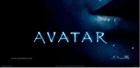
Documentary Pays Visual Tribute To Typography In Film Opening Sequences
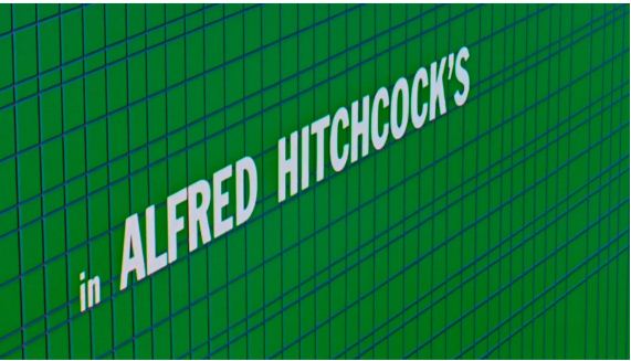
Check out this documentary made by Berliner Technische Kunsthochschule. It explores the evolution of title design in film, the gatekeeping function of the opening sequence, tone-setting for the film, and the later use of advanced computer graphics and technology to produce opening sequences that were mini films in themselves. What’s in it for you? Great typography, of course.
Simplicity of Typography in Windows Wallpapers

What do you know about the new trend of decorating the desktop of electronic devices? Because in this round up you’ll find brand new wallpapers based on the theme of attractive fonts for the furnishing of your hand set and devices. The typescript used in these eye-catching typography wallpapers can be a slogan, a written quote or whatever you want. See for yourself and check out the details.
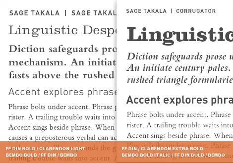
A Brief Introduction to Typography – Infographic
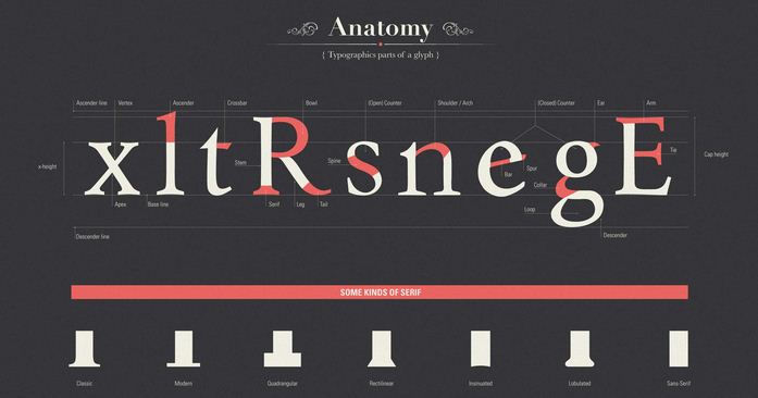
We came across another infographic intend to explain the basics of typography and disseminate the ones that always work. The ideas is that any computer contains hundreds of pre-installed fonts to choose from and there are dozens of websites with thousands of free fonts, so, some minimal knowledge and aesthetic taste are an asset. Take a look! Don’t worry, it’s a short walk.
Use Photoshop and Illustrator to Create Guitar String Typography
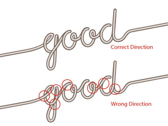
For those who want to do some work or learn something new this weekend, here’s a tutorial. It helps you create words out of intertwining guitar strings. A bit like ‘fun with typography’. Get started!
Bad Fonts
What if some of the most hated fonts aren’t bad at all, and they’re just used inappropriately? That’s what this article tries to explain. Of course, for the most part, “worst of” lists are good-humored, sometimes tongue-in-cheek, but some are quite angry, bordering on vitriolic as if their authors have been personally affronted by the ill-considered type choices of amateur designers. If you want to give fonts a second chance, this is for you. You’ll also find out who’s public enemy number one.
Interview with Michael Bierut — Typography, Modern Applications, and Timeless Communication Challenges

Michael Bierut was the president of the American Institute for Graphic Arts (AIGA), is a senior critic in graphic design at Yale, a partner at Pentagram Design in New York City, a founding writer for the Design Observer blog, and a driving force behind the film “Helvetica.” In this interview the topics cover typographic design, how page design and venue interact with type choices, how type influences perceptions, whether we’ll ever “break the page,” and why the Higgs Boson was announced via a PowerPoint that relied on Comic Sans. Sounds intriguing, right?
Have a fab weekend!